
If you’ve hung around Backblaze for a while (and especially if you’re a Drive Stats fan), you may have heard us talking about the bathtub curve. In Drive Failure Over Time: The Bathtub Curve Is Leaking, we challenged one of reliability engineering’s oldest ideas—the notion that drive failures trace a predictable U-shaped curve over time.
But, the data didn’t agree. Our fleet showed dips, spikes, and plateaus that refused to behave. Now, after 13 years of continuous data, the picture is clearer—and stranger.
The bathtub curve isn’t just leaking, and the shape of reliability might look more like an ankle-high wall at the entrance to a walk-in shower. The neat story of early failures, calm middle age, and gentle decline no longer fits the world our drives inhabit. Drives are getting better—or, more precisely, the Drive Stats dataset says that our drives are performing better in data center environments.
So, let’s talk about what our current “bathtub curve” looks like, and how it compares to earlier generations of the analysis.
The TL;DR: Hard drives are getting better, and lasting longer.
The intro: Let’s talk bathtub curve
If you’ve spent any time around hardware reliability, you’ve seen it: a smooth U-shaped line called the bathtub curve. It promises order in the chaos of failure—a story where devices begin life with a burst of defects, settle into steady performance, and finally wear out in predictable decline. And, this is what it looks like:

For decades, it’s been engineering shorthand for how things die. But as our dataset has grown—more than a decade of drive telemetry and millions of drive-days—the data is clear: Our real drive population is more complicated.
What the bathtub curve looked like then
The first time we ran this analysis was in 2013, and when we updated the article in 2021, we shared this chart:
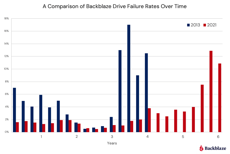
It shows the annualized failure rate (AFR) of the full drive pool over time (in years) at two different look-back points—2013 and 2021. At that time, you could already see that the bathtub curve was starting to, as the venerable Andy Klein put it, “leak.” The 2013 data looks the closest to a true bathtub curve, while the 2021 data shows fewer early failures and a lower failure rate for more years. We also see the average longevity of drives goes up by about two years before spiking into the failure zone.
Numbers can both define and obscure reality
Now, there are some very interesting factors that come into play when comparing hard drive reliability over time. For example, our usual caveats about how we use drives vs. how consumers use drives, how our workloads have changed over time, etc. More importantly, though, because we’re comparing averages, it’s easy to lose track of the context around our dataset—how many hard drives are we talking about in 2013 vs. 2021?
When we did this analysis in 2013, Backblaze had been open for six years, but we’d only been publishing the Drive Stats dataset since 2013. So, arriving at presenting a look-back at the data (i.e., this is how many drives failed when they were between zero and one years old) was a bit of a math problem compared to our usual data reporting. We were talking about drives that entered the drive pool in 2007, and those were ones we hadn’t shared complete daily logs about, even if the drive was still in service in 2013 (which, as you can tell from the data, was unlikely). We achieved that by looking at failures vs. logged on hours, and when we re-created the analysis recently, we used this SQL query:
CREATE VIEW introduction_dates AS
    -- Calculate the introduction date of drives that were already in service on 2013-04-10
    SELECT serial_number, date(date_add('hour', -1 * smart_9_raw, TIMESTAMP '2013-04-10 00:00:00')) AS introduced
    FROM drivestats
    WHERE date = DATE '2013-04-10'
    UNION
    -- Use the minimum date for drives that entered service after after 2013-04-10
    SELECT serial_number, MIN(date) as introduced
        FROM drivestats
        WHERE serial_number NOT IN (
            SELECT serial_number
            FROM drivestats
            WHERE date = DATE '2013-04-10'
        )
        GROUP BY serial_number;

SELECT
    date_diff('day', d2.introduced, d1.date) / 91 AS age_in_quarters,
    100 * 365 * (cast(SUM(d1.failure) AS DOUBLE) / COUNT(*)) AS afr
FROM drivestats AS d1
INNER JOIN introduction_dates AS d2
ON d1.serial_number = d2.serial_number
GROUP BY 1
ORDER BY 1;
Our drive pool looked a lot different in 2013 as well. Not only was it smaller (~35,000 drives and over 100PB of data were live as of September 2014), but it also was made up of “consumer” drives. While we didn’t see much of a difference between the two when we actually tested them in the environment, we did a lot of drive farming in those days, a process that included actually “shelling” the drives and removing them from their housings—which means that our drive pool had a lot more potential to get some bumps along the way. Hard drives are pretty resilient and we were careful, but it’s worth noting.
By the time we were doing this analysis in 2021, we had a lot more data and a lot more storage drives—206,928 or so. Between 2013 and 2021, we had added capacity to our Sacramento data center; expanded our data center regions with locations in Phoenix and Amsterdam, with more on the way in 2022; we launched Backblaze B2 Cloud Storage; and, we went public.
All those things are cool from a historical perspective, but the more impactful thing to pay attention to is that any time you have less data (read: a smaller number of total drives), each individual data point has more impact on the whole. In the bathtub curve, you naturally reduce the number of drives as they get older—every drive has a day one, but not every drive has a day 1,462 (or, in lay people’s terms: four years, one day). With fewer drives, more spikes. So, if you start off with more drives, your numbers are likely to be more steady—unless there’s a real problem, or you’re entering your true drive pool failure zone.
And, since we’ve transitioned to buying more drives, and decommissioning drives in a different way—well, that all affects what the end result is. More on our drive hygiene habits later; for now, let’s get into our current data.
What the bathtub curve looks like now
Without further ado, let’s look at the failure rates in our current Backblaze drive pool:
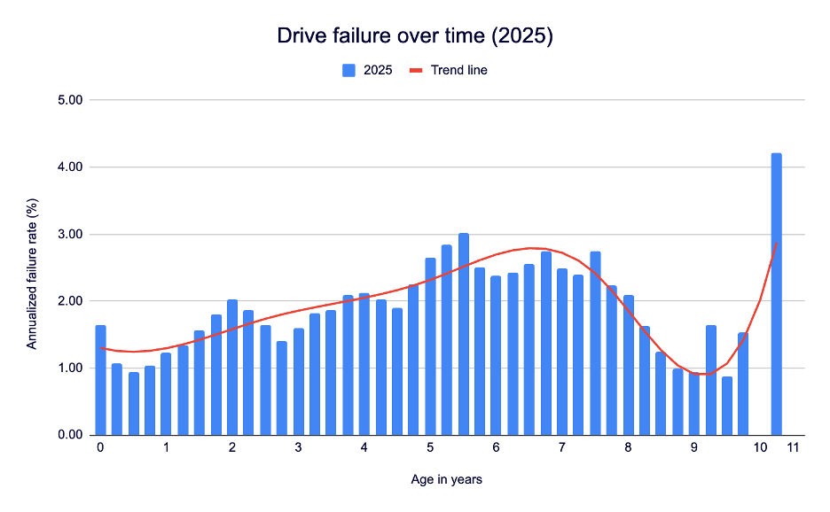
That’s a pretty solid deviation in both age of drive failure and the high point of AFR from the last two times we’ve run the analyses. When we ran our 2025 numbers (at the close of Q2 2025), we reported on 317,230 drives. Take that as an approximate raw number given the normal drive exclusions in each Drive Stats report, but it gets you in the ballpark.
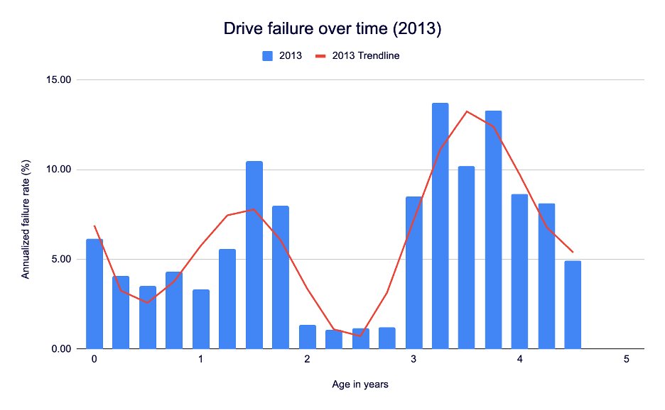
For consistency’s sake, here’s 2013:
And here’s 2021:
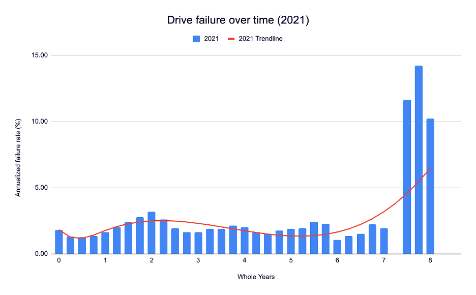
What’s missing, and a bit difficult to visualize, is the scale on both the x axis (time in years) and the y axis (annualized failure rate expressed in percentage). Let’s put all three on the same chart:
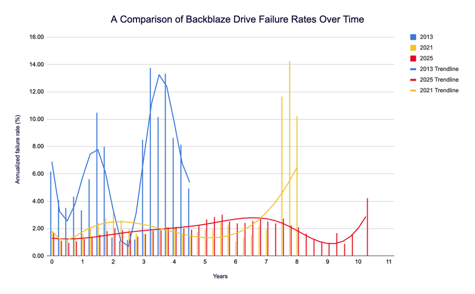
Note that both the 2013 data and the 2021 data have high failure percentage peaks at some point near the end of their drive lifetimes. In 2013, it was 13.73% at about 3 years, 3 months (and 13.30% at 3 years, 9 months). In 2021, it’s 14.24%, with that peak hitting at 7 years, 9 months.
Now, compare that with the 2025 data: Our peak is 4.25% at 10 years, 3 months (woah). Not only is that a significant improvement in drive longevity, it’s also the first time we’ve seen the peak drive failure rate at the hairy end of the drive curve. And, it’s about a third of each of the other failure peaks.
Meanwhile, we see that the drive failure rates on the front end of the curve are also incredibly low—when a drive is between zero and one years old, we barely crack 1.30% AFR. For reference, the most recent quarterly AFR is 1.36%.
Still, if we take a look at the trendlines, we can see that the 2021 and the 2025 data isn’t too far off, shape-wise. That is, we see a pretty even failure rate through the significant majority of the drives’ lives, then a fairly steep spike once we get into drive failure territory.
What does that mean? Well, drives are getting better, and lasting longer. And, given that our trendlines are about the same shape from 2021 to 2025, we should likely check back in when 2029 rolls around to see if our failure peak has pushed out even further.
Hey, what about that data contextualization you did above?
Good point—there are significant things that have changed about our dataset that may be affecting our numbers. We’ve already tackled the consumer vs. enterprise drive debate, and while we don’t have updated testing on that front, there are other things about buying drives at scale that may have an effect on the data.
For instance, because we buy drives in bulk, that means that a big chunk of drives enter our data pool at the same time. Given that we, over the years, have really only seen model-by-model variation, this means that if you get a lemon of a drive and you’ve added a lot of them, you may have a chunk of drives failing all at once.
Also, we have a different process for decommissioning drives these days. There are lots of things that go into that strategy, but you can simplify it all to risk management and our ability to grow our storage footprint over time. From a practical perspective, that means sometimes there are drives that are still performing well that we decide to take out of service anyway—and that means they get taken out of the fleet without ever having failed. Since our analyses above are based on annualized failure rate vs. age of drive, you can see a big drop in drive population without the expected failure rate spike.
Finally, we have different standards for new drives. Some of them just have to do with the industry at large—drives are getting bigger, and storage patterns are changing. But, compared with 2013, when a natural disaster forced us to innovate in unexpected ways, we’ve got more flexibility to consider our purchases, and to do so in a way that’s specific to our environment.
Was the bathtub curve just wrong?
The issue isn’t that the bathtub curve is wrong—it’s that it’s incomplete. It treats time as the only dimension of reliability, ignoring workload, manufacturing variation, firmware updates, and operational churn. And, it rests on a set of assumptions:
- Devices are identical and operate under the same conditions.
- Failures happen independently, driven mostly by time.
- The environment stays constant across a product’s life.
The good news: When it comes to data centers, most of these are as true as they can be in a real-world environment. Data centers environments attempt to be as consistent as possible to be able to reduce power consumption, and to be able to properly anticipate and plan data workloads. Basically, consistency = a happy data center.
That said, conditions can’t ever be perfect. Our numbers have always and will always reflect both good planning and the unforeseen aspects of reality. Understanding whether drives are “good” or “bad” is always a conversation between what you theorize (in this case, the bathtub curve) and what happens (the Drive Stats dataset).
What’s next?
Why does all this talk of numbers matter? Well, as we’ve expanded our drive pool over time, in some ways, we’ve increased confidence in the results we’re seeing, both on day one and day 1,462. Even if we had the exact same drives models and drive pool make up (by percentage) from 2013 that we did in 2021, having more of them would give us better results. But, now we have a greater diversity of drives and more of them.
That doesn’t mean we’re the be-all, end-all of drive reliability, but it does give us some more footing to slice and dice the data and bring it back to you. As always, you can find the full Drive Stats dataset on our website, which means you can repeat this experiment, or use the data in any way you can imagine. Stay tuned for our quarterly reports and more articles from the Drive Stats extended universe—and feel free to sign up for the Drive Stats newsletter if you want to stay up-to-date.