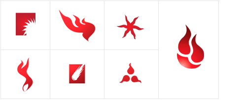
When we were thinking about a logo for Backblaze, we knew we wanted an iconic image that could be connected easily to the software. That meant creating something simple enough that could scale to 16×16 pixels for an icon placed in the system tray. Logos are probably the most difficult for me as a designer to do. There is a feeling that a company will live with this identity for the rest of its life, so it better be perfect. And everyone has a different opinion: “That looks too ‘techy.’ Can we make it more catchy? It looks like a squished squid.”
Well, squished squid or running starfish, it’s good to get the stakeholders opinion. As a designer, such criticism makes me articulate what I am trying to accomplish, rather then just feeling intuitively through the design process.
So what do I think of the Backblaze logo? It’s all flamey and stuff.


